Abranova Real Estate
Logo, Branding, Collateral
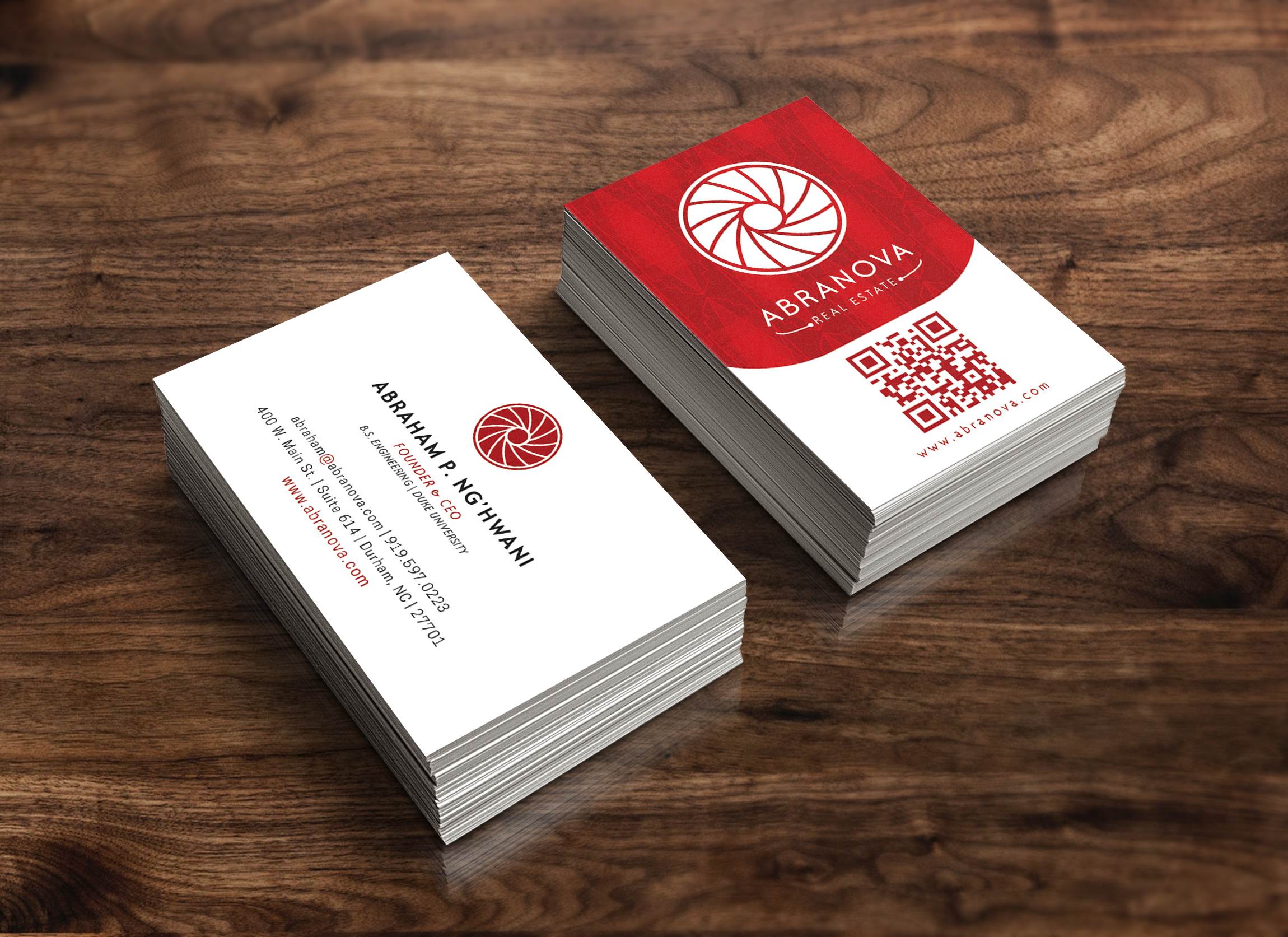
Abranova Real Estate is a Durham grown startup that needed sophisticated and tight branding to appeal to an audience of high profile investors, both foreign and domestic. It’s design had to speak modernity and elegance, but also traditional professionalism from a buyer’s perspective. In an industry that either swings all the way traditional or extremely modern, its hard to find a visual balance that appeals to all segments of Abranova’s audience.
The personal branding for the company that was mostly shown to investors, we stuck to a modern and dynamic look. For materials used for clients and home buyers, we reflected the homes themselves in the design, with traditional details such as classic typefaces and colors; and an easy-to-follow layout for floor plans and informational guides. This resulted in all of Abranova’s first project offerings pre-selling and paving the way for their second major project: Nova RTP - an innovative living community at RTP.
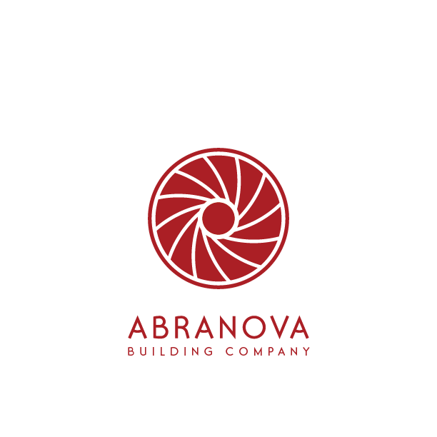
Abranova’s updated logo
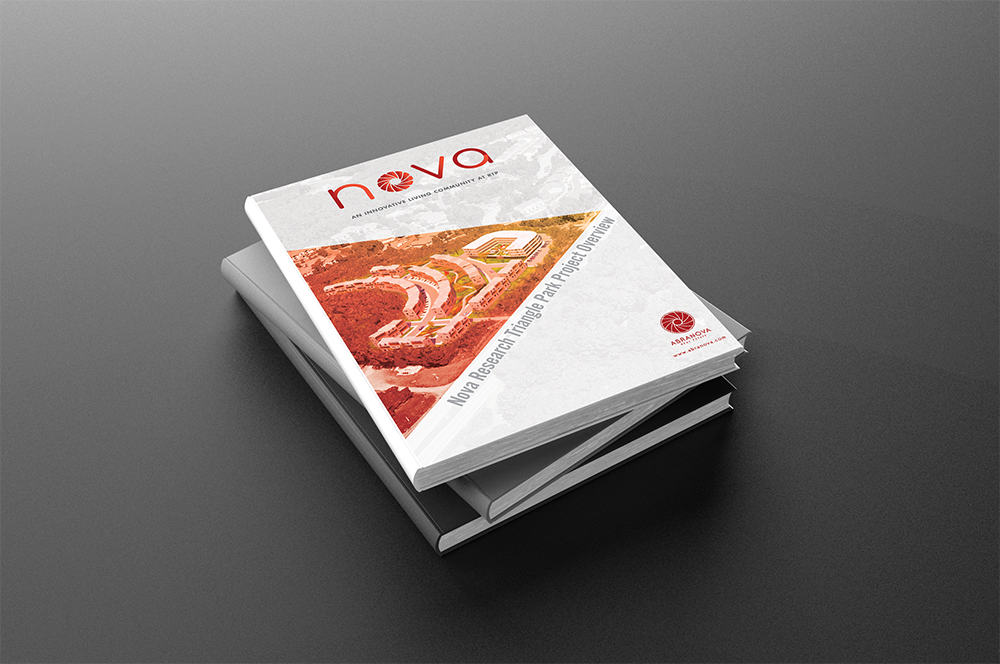
Cover design & layout for the Nova RTP Investor’s Overlook Report
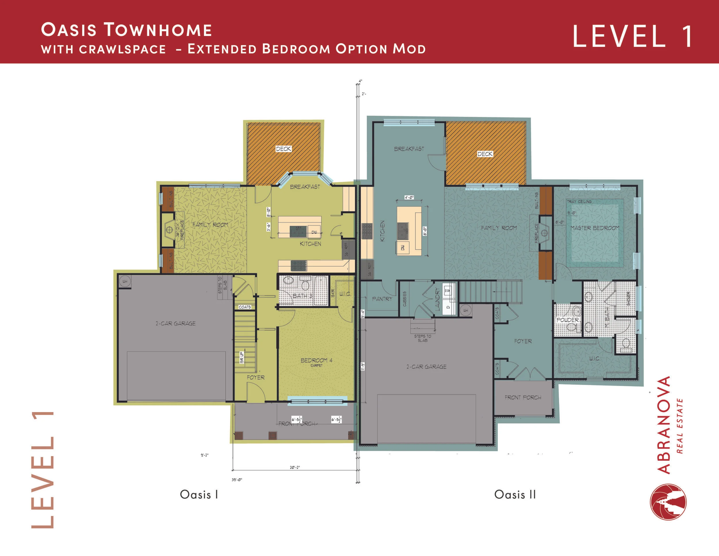
One example of many floor plan pages laid out and colored
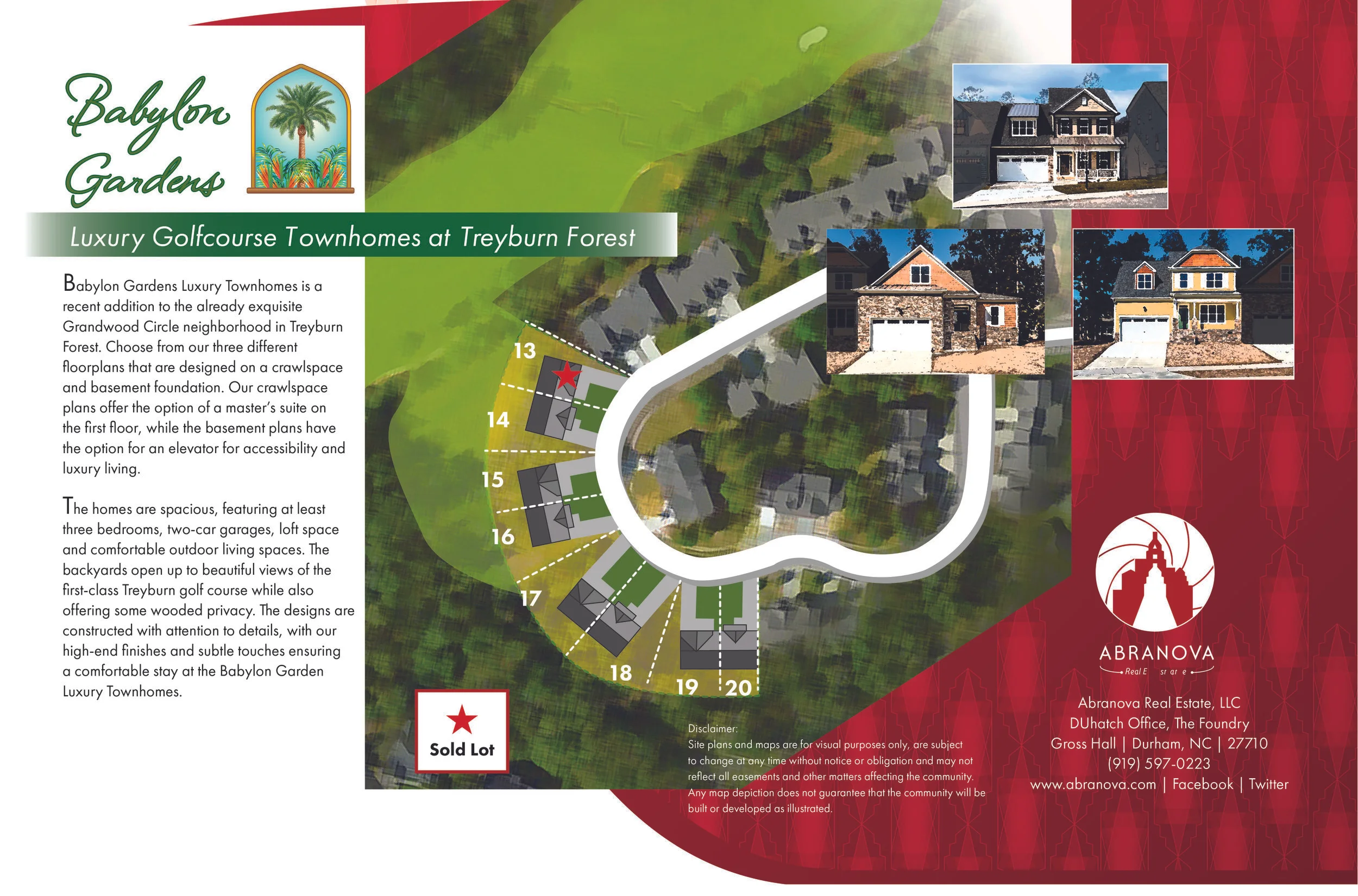
Babylon Gardens Folio inside
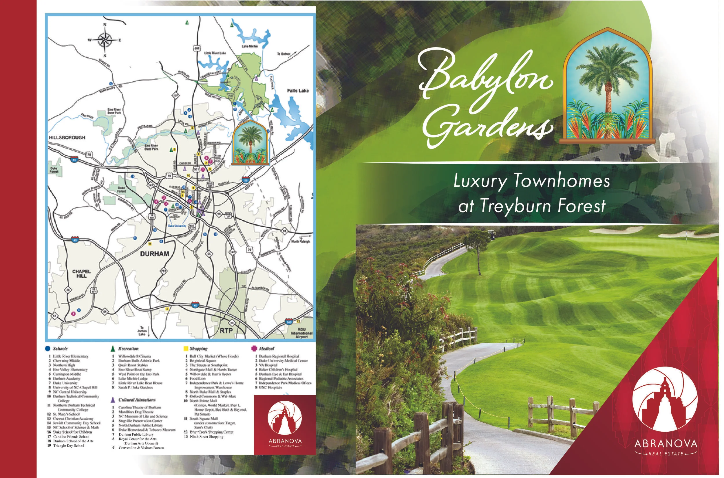
Babylon Gardens Folio cover
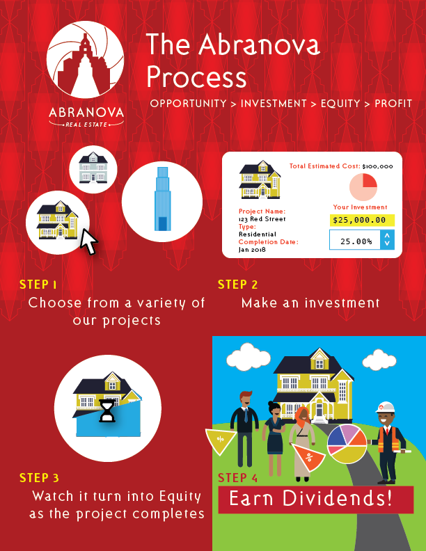
Illustration of the Abranova Process