Tawasaw
Branding , Layout, Marketing
Youth Organization Rebrand
Tawasaw is a 501 (c) 3 non profit institution based in Santa Clara, CA whose identity needed an energy boost as well as a softer touch.

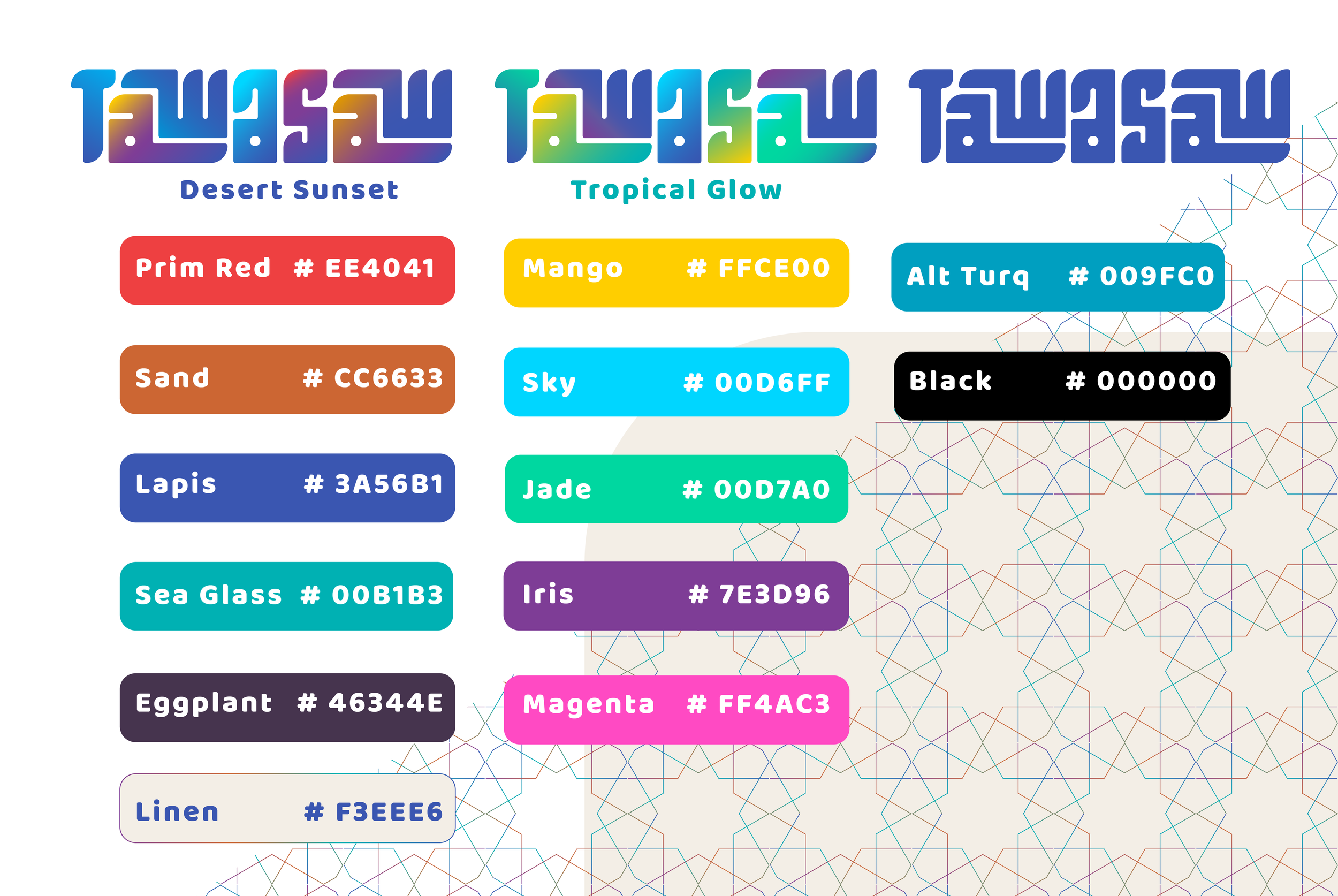
Original logo
Inspiration
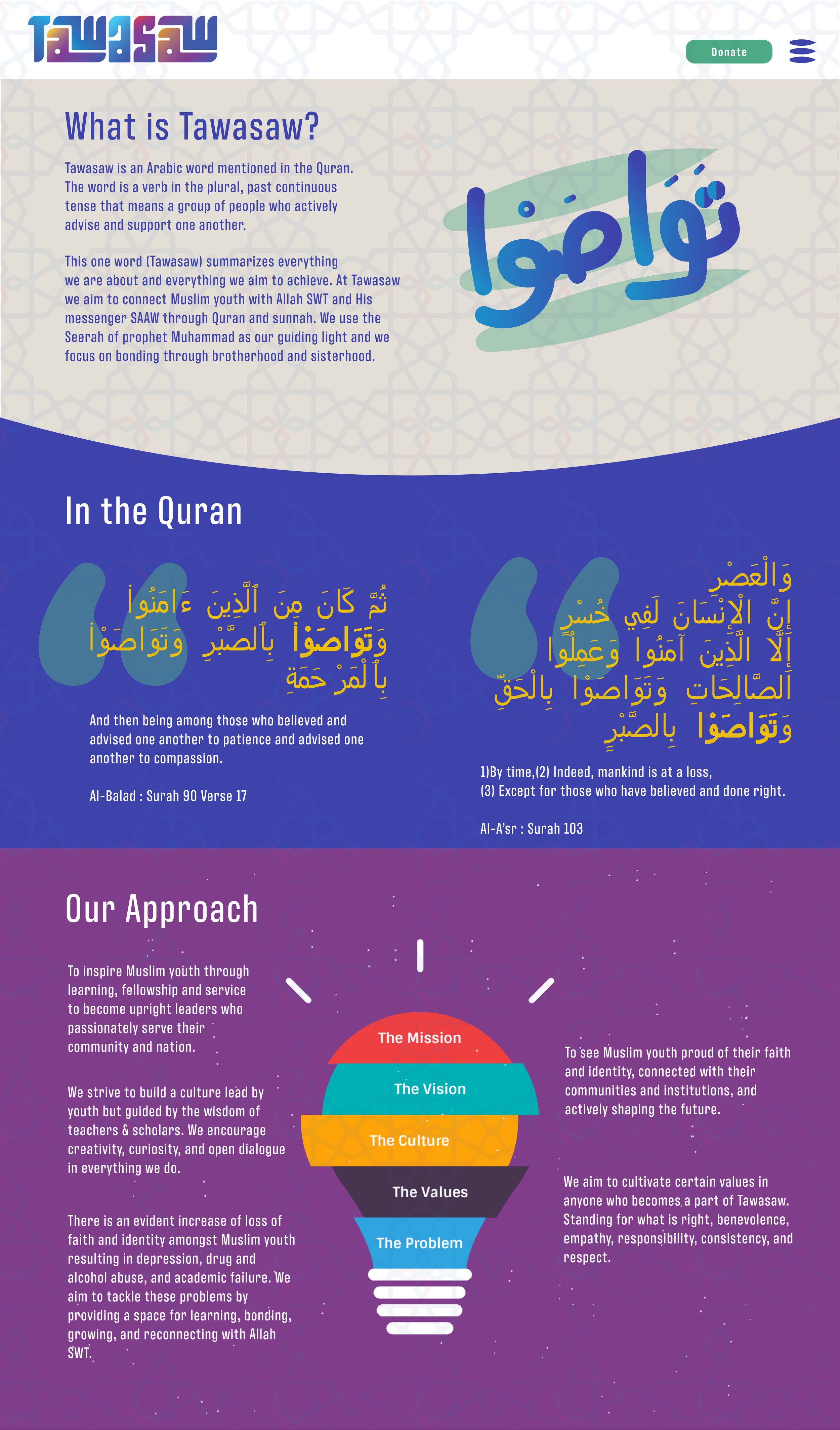
The original logo was a bit flat and hard to read, although it captured the idea of Arabic Kufic script well, for a religious youth organization, the type had too many hard edges which made it feel uninviting. We started off by simply making the letters more organic - as if written by a brush rather than a flat-edged reed. Next we added new colors to adapt for transitions as well as simply expanding identity for it’s use-case in which the colors would signify particular grade levels and subject matter covered across Tawasaw’s programs and courses.
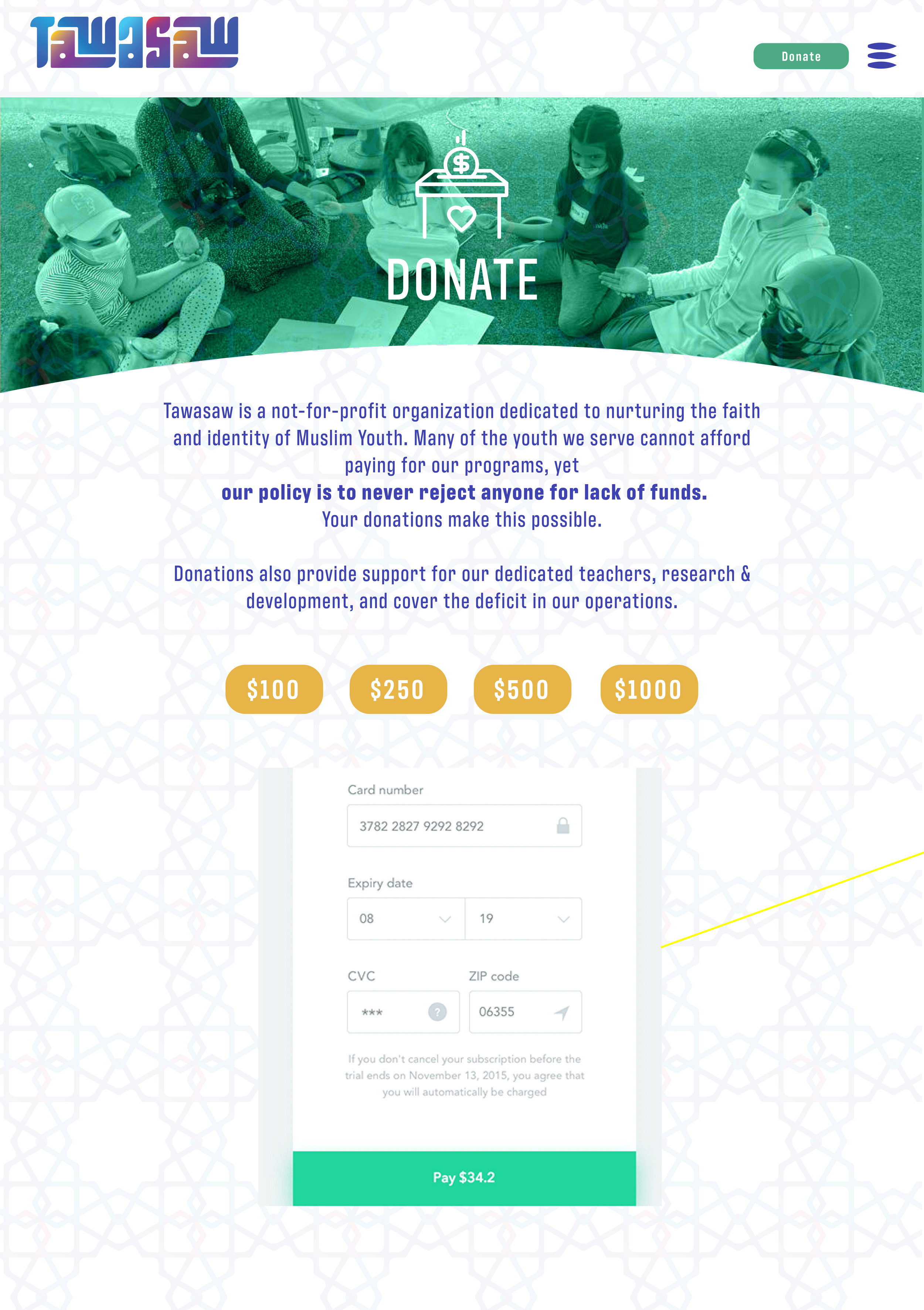
Tawasaw’s website is still under development but the new design brings together classic historical motifs with modern and youthful colors in an easy to navigate interface for busy parents trying to entice their kids to connect.